To help with making our album front cover, we looked at different artists to see what theirs what like. We discussed what looked the most effective and what would work well with what kind of style we were trying to get across. Below are some of the covers which i thought looked good and got inspiration from.

These two album portray the typicial conventions of a pop artist album cover, the artist is the main image and is in the middle focusing all on them. Rita Ora's imagie is black and white. White gives across the sense of purity and makes us feel as though she is successful.
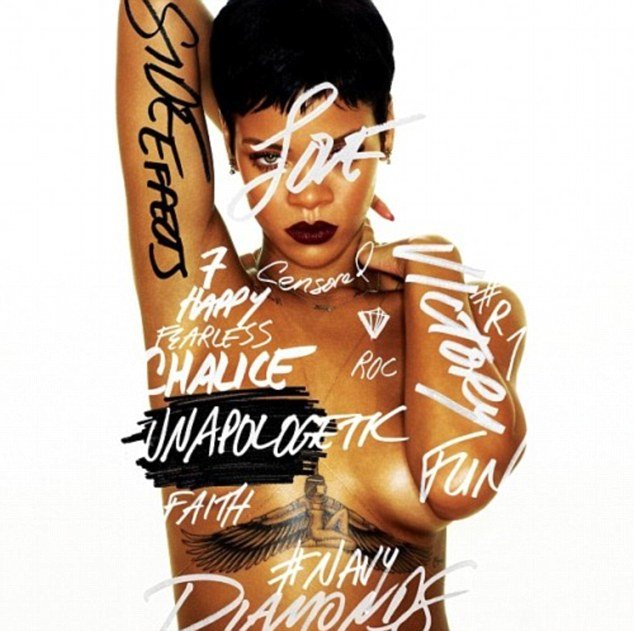
Rihanna is then similar in a way that it is focused on her. If you know who Rihanna is then you straight away know this is typical her and the image fits in well with many of the style of songs that she does. And if you dont know her or her songs then you straight away can guess what kind of music you are buying. For both covers the writting is a colour which stands out clearly.


These two albums are very different to the first two but then similar in the way that they focus all on the artist's and nothing else. Me and Jess both liked very much the idea of having a split screen or 3/4 boxes, either on the front cover of the album, or even in the actual music video, if not both. We of course though only have one artist so thought that four pictures of the same person on the front, may look slightly odd, and might make people think its a band rather than one single artist. The colors Little Mix have chosen are very vibrant. The pink and blue contrast well and are complete opposites. Their makeup is very subtle, with the pink lips, and their hair stands out quite a lot. The colors Destiny's Child have chosen for their album cover are completely different to those of Little Mix's. Destiny's Child have chosen very neutral colours, which i also think looks very effective.


These two albums are completely different to all four we have already looked at. They don't have a picture of the artist on the front, which you may think is strange because you don't know who the person is who's album you're buying. Mika's album you straight away look at and think he is quite different, and in a way kind of weird. Which to be honest, he is. his music is quite quirky and fun, which you see from looking at the album cover. This is a good way of attracting an audience, by choosing to put pictures and bright colours on the front, so you straight away look at this over all other albums. All of Coldplay's album have a picture on them. This could be because of who they are though. They're a band with four men, who are around the age of 40, and so may not be the type to have their faces printed all over the front cover. Their album covers are still effective, in the way they are different, and some of them are quite weird, which you are more likely to pick up than a picture of four men's faces.
No comments:
Post a Comment